
At the beginning of the year we were assigned to produce a project based on memories, I decided to explore the distortion of childhood memories. I started by researching memories and the psychology behind how memories become distorted, to give my project a personal aspect I used a selection of images taken from my own childhood.
I began by trying to express the distortions of memory through the use of colour, I produced a water colour softly using the colours to faintly outline one of my own images this represented the fading of memories. I then paired this with bright painting of dripping paint; I did this as it contrasted with the faint outline of the memory to show the expressive enhanced memories of childhood.

I proceeded to do some “rough” sketches in my art pad, not dissimilar to Kathe Kollwitz, I believe these sketches effectively captured the movement of childhood, effect of the pencil captured the “sketchy-ness” of the memories. I also delved into the use of transfer; printing images on paper using paint, which gave the images a “tarnished” effect, which again related to the distortions of memory I also used brightly coloured paint to enhance the happiness and vibrancy of childhood.


I then explored the use of recycled materials on my work in order to “catch a moment”, I used an old Mcdonald’s happy meal box to symbolize the enhanced enjoyment you feel as a child and ink splattered kitchen roll in my textile pieces, which really capture the physical memories of being a child. I also experimented with water colour using it expressively; with lots of drips to try and capture the true love and emotions that children feel. Again perpetuating this idea that when you are a child everything is “brighter”.
I used textile to show the distortions of childhood, and explore the idea of how memories are confabulated when a child and the stitches represent the “inaccuracies” when trying to reconstruct a memories, again bright primary colours were used to try and present this idea of simplicity and clarity a child’s life processes.


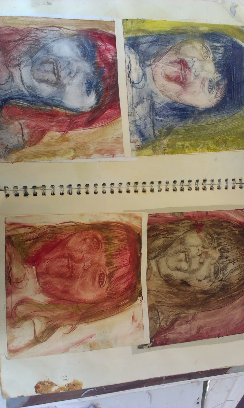


The next project was a project I assigned myself. I decided to explore how the face can be used as a platform to express message and meaning I began this by taking pictures of faces with numerous expressions and began to look at the use of inks to express these messages, developing my ink use from the previous project.
The artist I used for inspiration was Marion Bolognesi, as I love the way she uses inks to display emotions and messages. I used inks faintly and then contrasted more intensely in certain areas to create drama and emotion, I become extremely interested in the idea of colour to express feelings and emotion, cool colour such as blues, greys and greens were used to give of cold expressions such as jealousy and pain and then I used warm colours such as hues, pinks reds and oranges for warm emotions such as happiness and love. I then proceeded to do a series of oil paintings using the oil in a similar way focusing harsher brush strokes on the emotive parts of the face such as eyes and mouth and smoother less textured stroke on the background to contrast and enhance the dramatic parts of the piece.


I then developed this idea of the face and emotions to display the message of manmade society and how it represses nature. I portrayed this idea by using smooth paints and inks to represented the gentleness and vibrancy of nature contrasted with the harsh geometric lines and illustrations of manmade society and the architecture of cities. I explored using real nature into my art through etching leaves onto contracted paintings and drawings; I also used rope to show repression and the way in which society is “tied” down and nature is free.


